
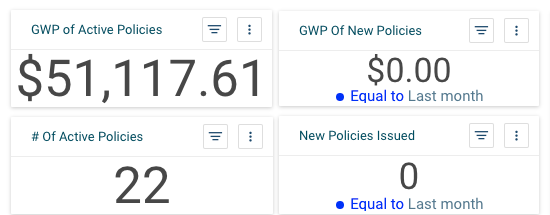
As insurers tackle the new industry challenge of digital transformation head on, one of the challenges they face will be monetizing and drawing insights quickly from the treasure trove of data present. To this end, PolicyDock’s APIs can help anyone along the insurance value chain create customized dashboards reflecting their needs.
Have one for the overall business that highlights Gross Written Premiums; create another that allows claims managers to track activity by product line and across territories; track insurance broker and customer attrition with a third visual display. There are many possibilities, each one of them easily achievable through PolicyDock for the following reasons:
- Data is pre-cleaned
The volume, velocity, and variety of company data available contains information that can deliver pointed insights into the business. However, synchronising variable names, treating missing values, stripping redundant punctuation are usually a necessary precursor to performing ‘juicy’ analysis. After all, it is worth remembering the computer science acronym of GIGO (garbage in, garbage out) which means flawed data will produce nonsense output.
PolicyDock’s technology removes the tedious step of data wrangling that is the bugbear of many data scientists. Instead, what you get is a ‘sanitized’ product that you can use for data modelling or dashboard development.
- Dashboards are a ‘drag and drop’ away
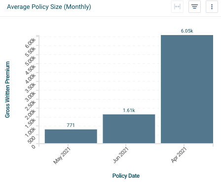
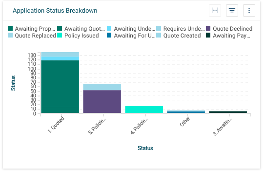
The visual representation of data is a simple, effective, and powerful way to convey information.
For instance, businesses can measure the performance of each underwriter by analysing product lines, loss ratios, risk cost per policy and expense ratios. Claims departments can compare claims between months, quarters, and years to understand the efficiency and productivity.
These metrics and more can be visualized on your own using a wide library of charts that come part of the package.
Specify the components you want to display as well as your preferred dashboard layout. Then filter the results anyway you want. If you want to embed the reports within any web application, SaaS, software, or even embed the report builder to allow your teams to create their own reports, these are also achievable.
- Choose how often you want data to be refreshed
Data can be assessed as soon as it appears in your system, but you get to decide how often you want the information to be updated: daily, weekly, monthly, quarterly – no problem.
If you would like to know more about PolicyDock, please contact us at demo@policydock.com
Related content:
- How strong is a business's cyber protection? Find out within seconds (1 min video demo).
- PolicyDock and Sensible help insurers turn PDFs intro structured data (1 min video demo).